Odyssey
Project Scope
Amazon Storefront Graphics
Listing Graphics
A+ Content Graphics
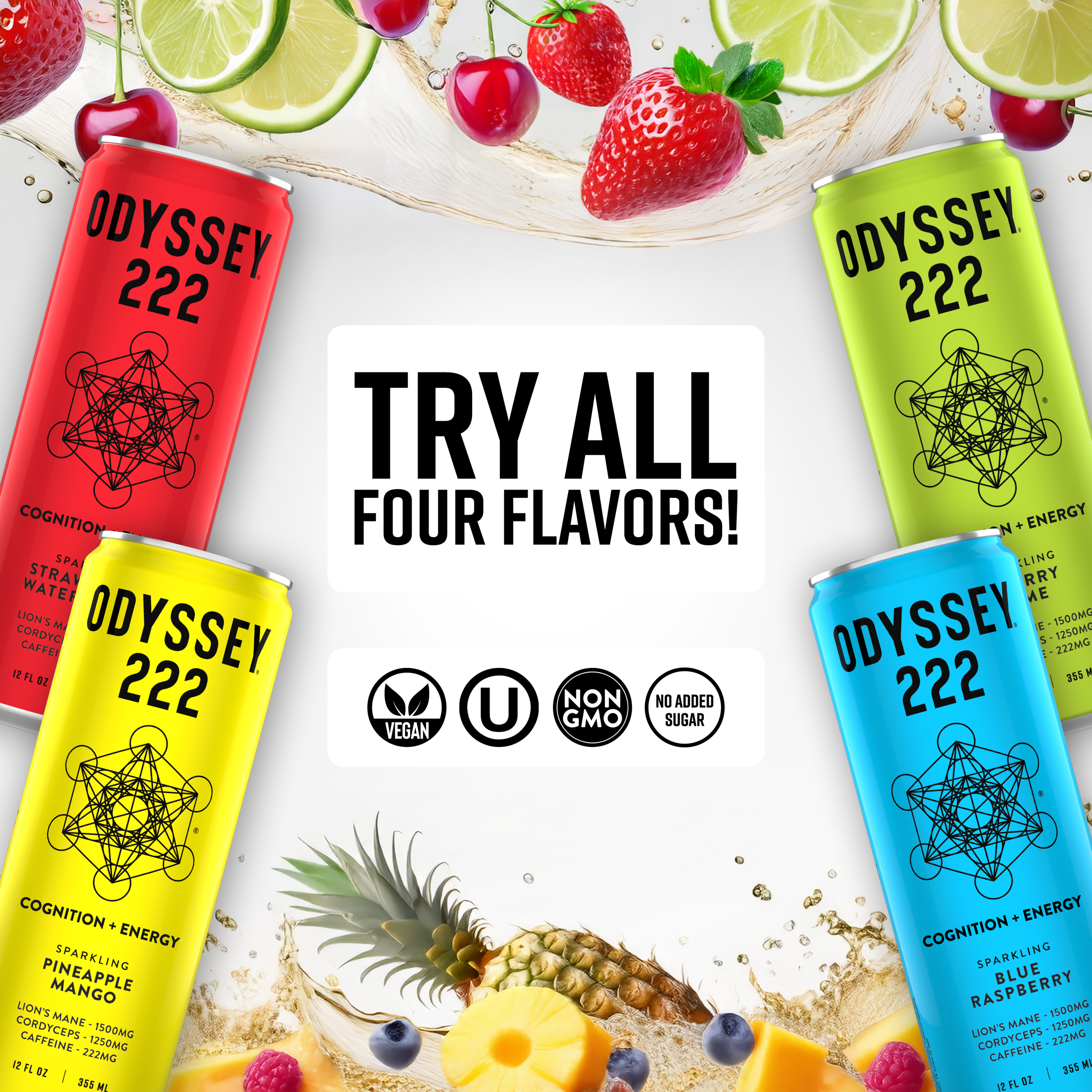
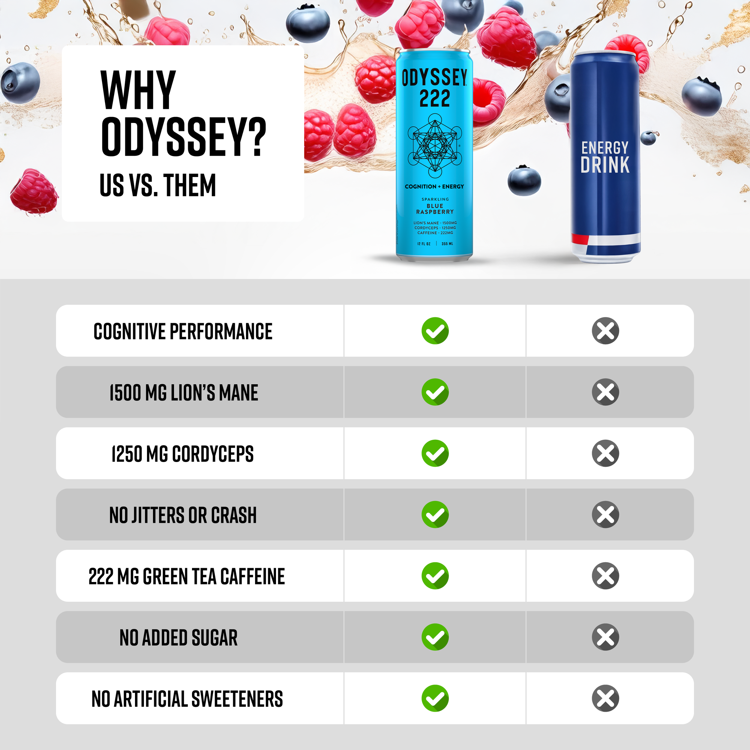
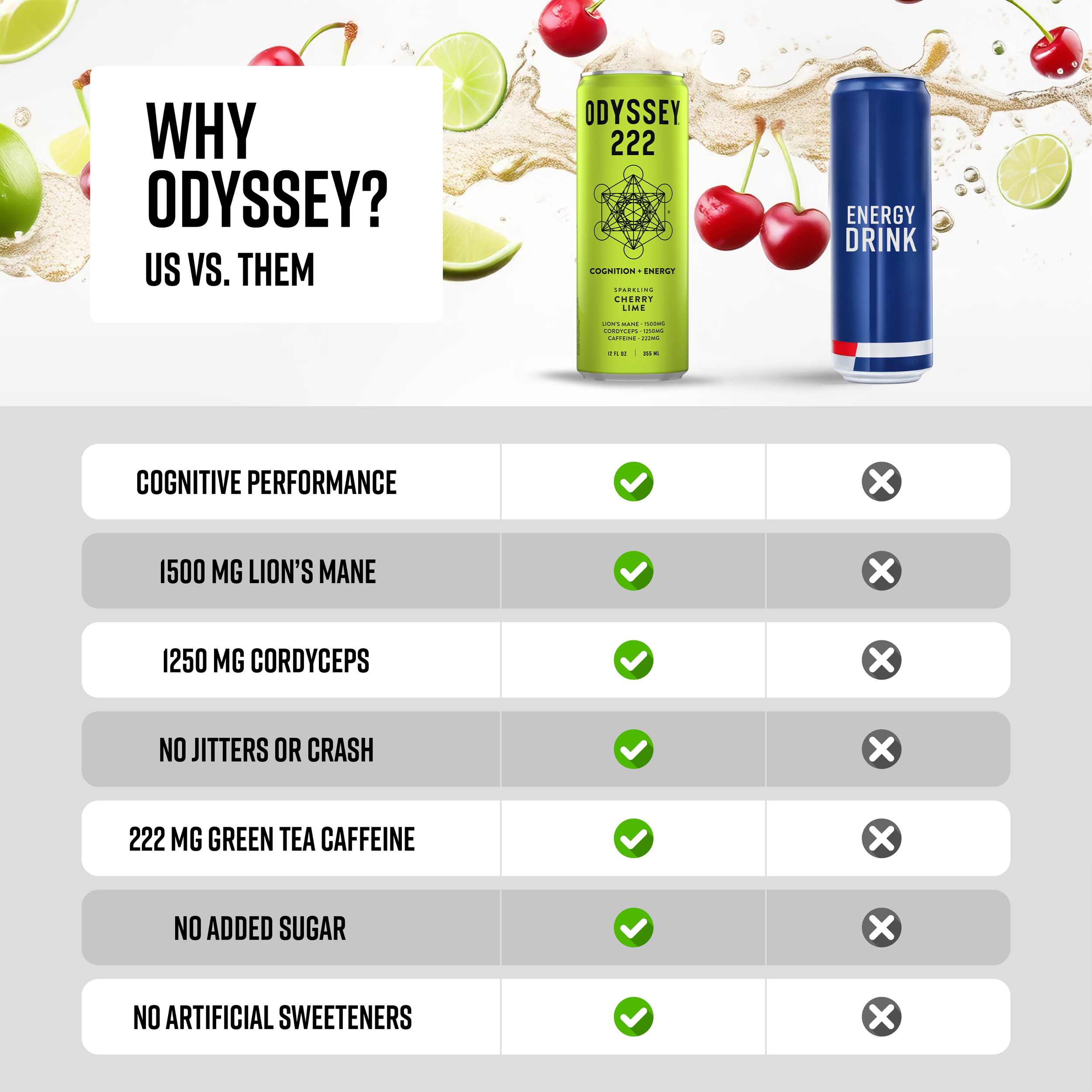
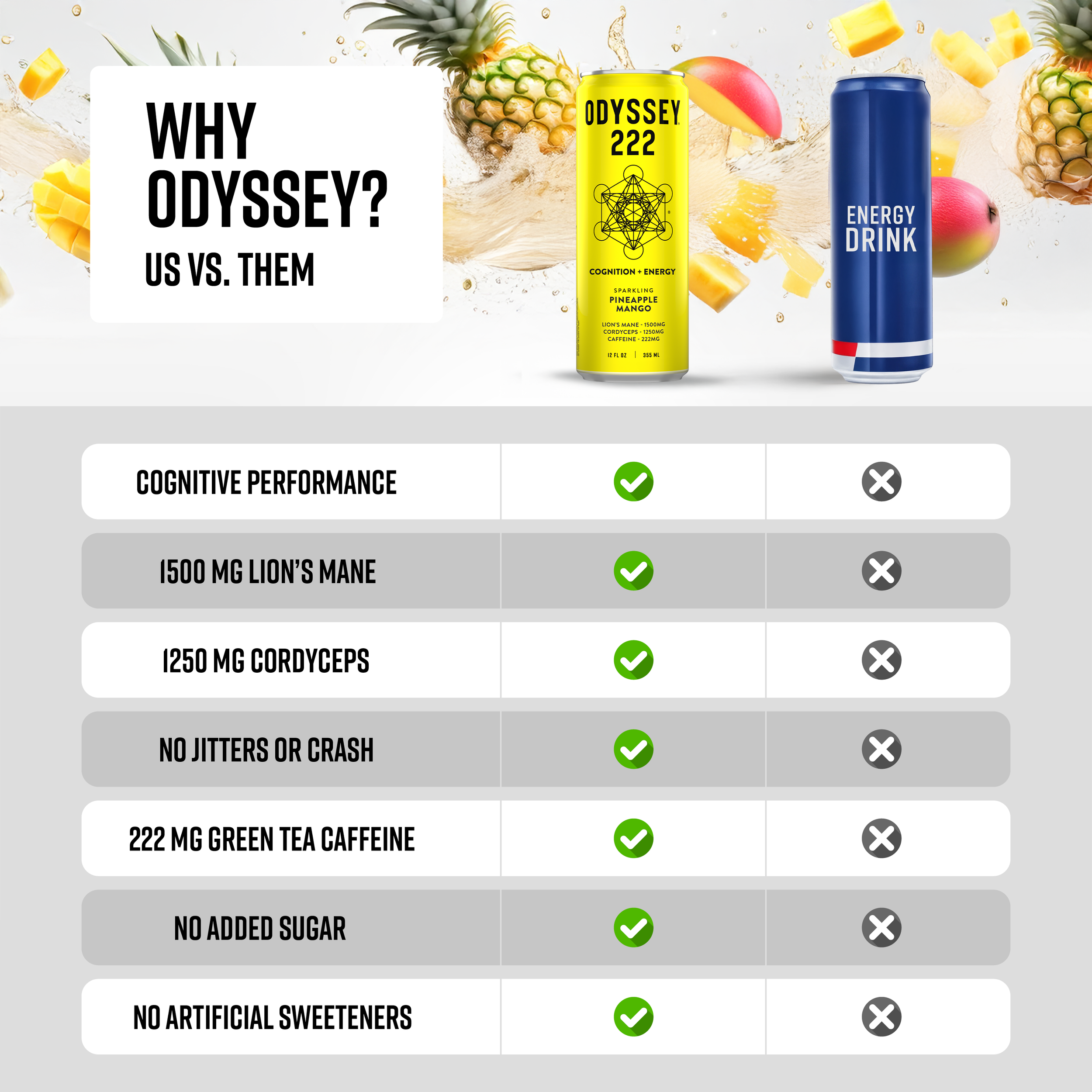
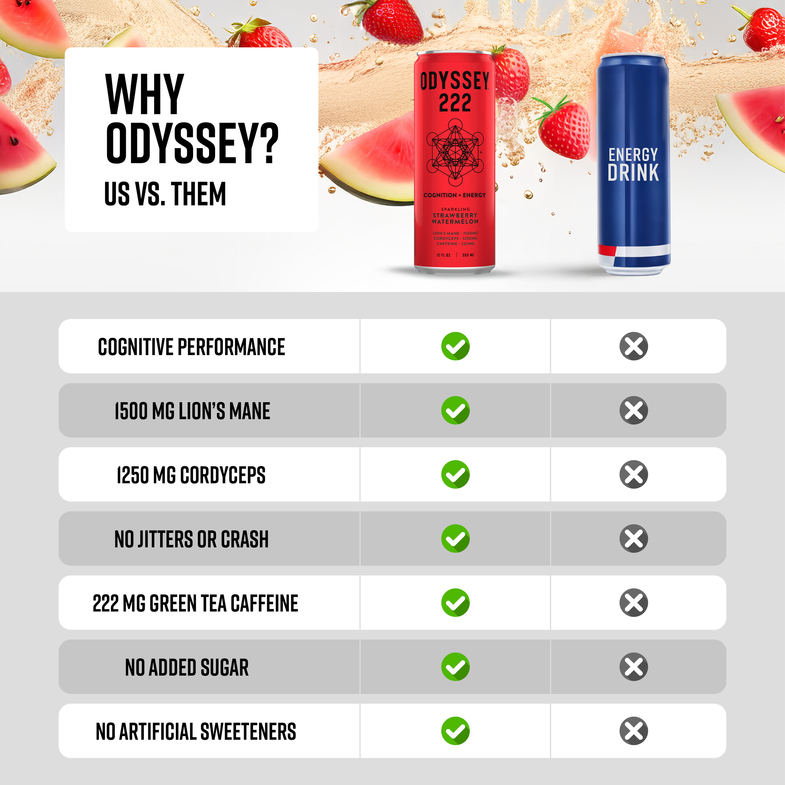
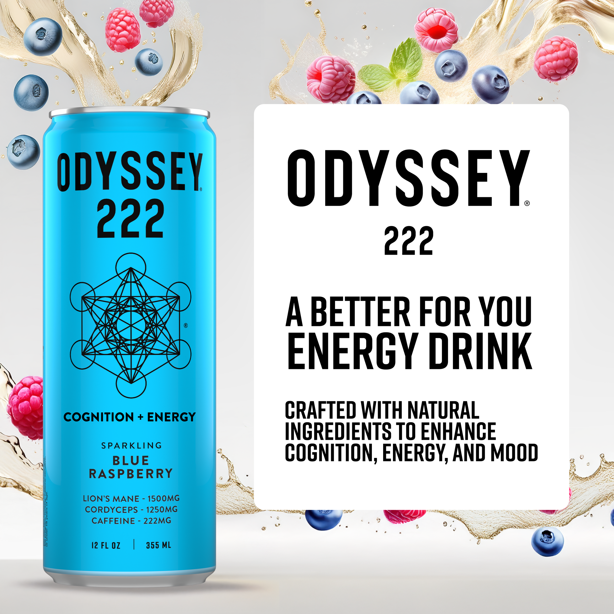
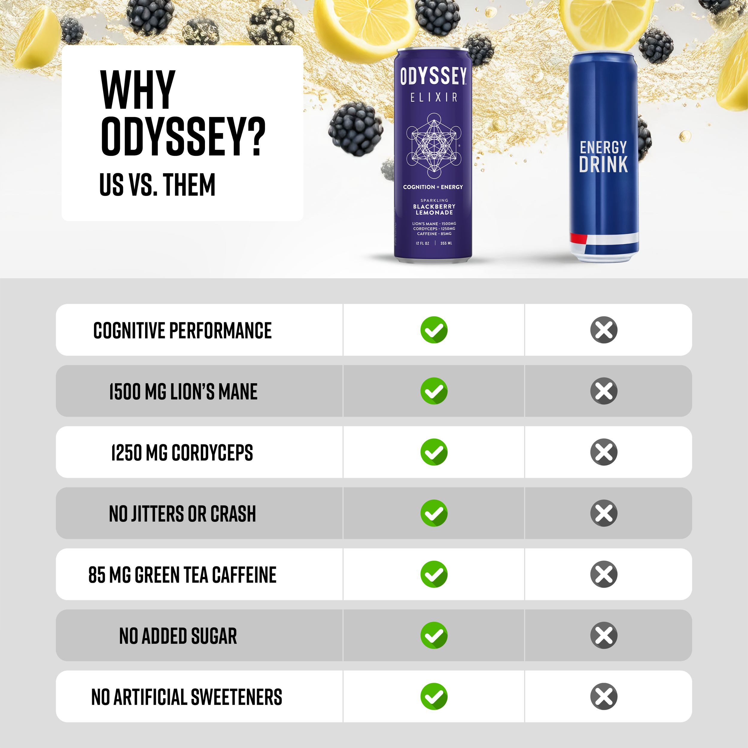
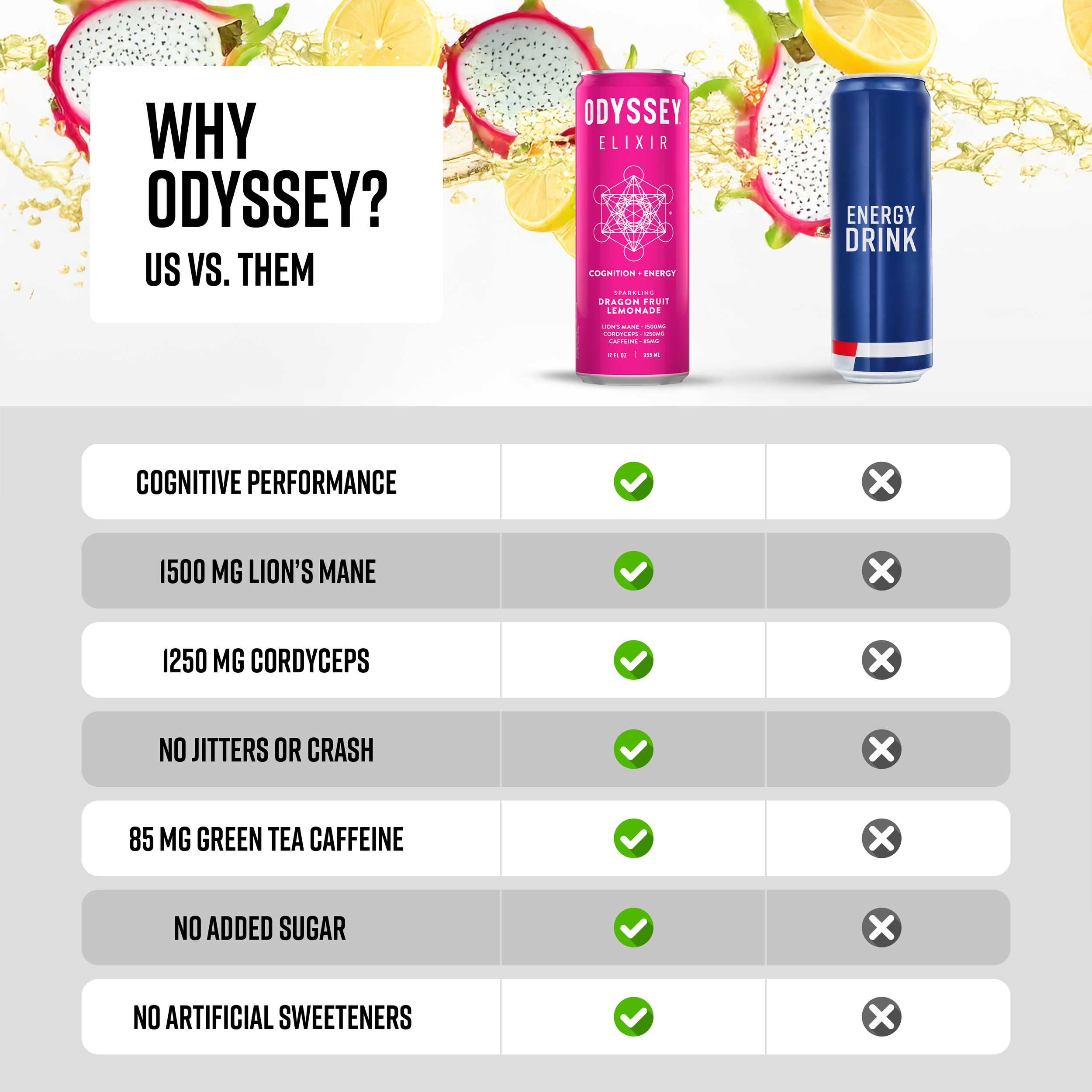
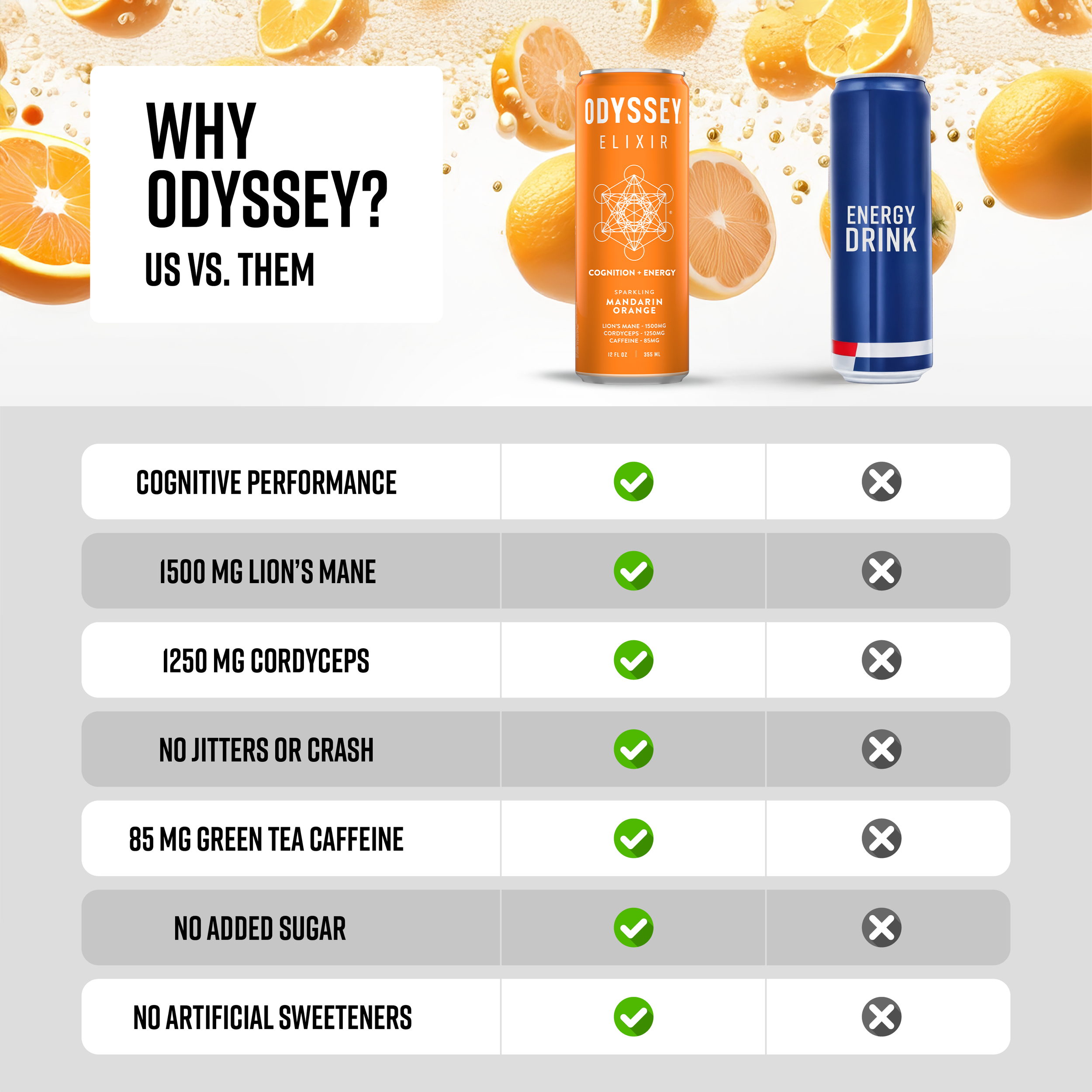
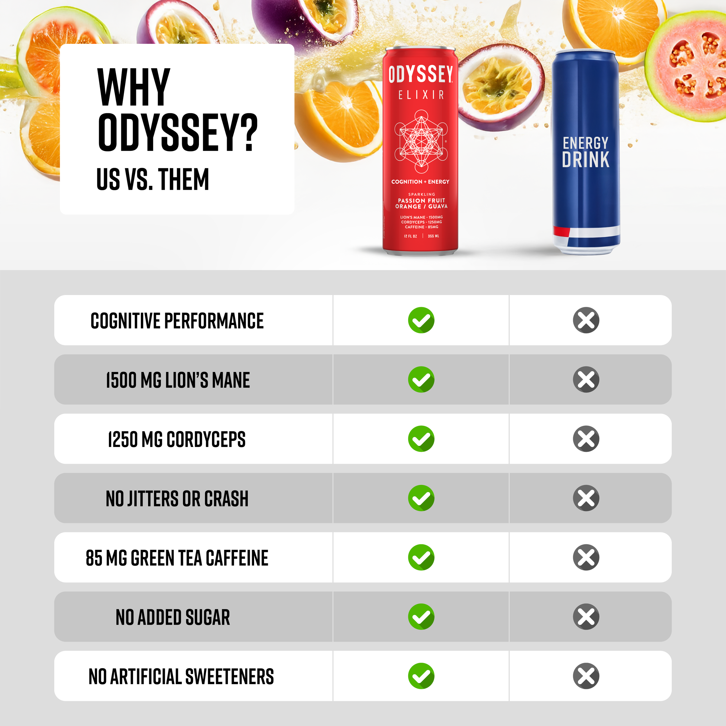
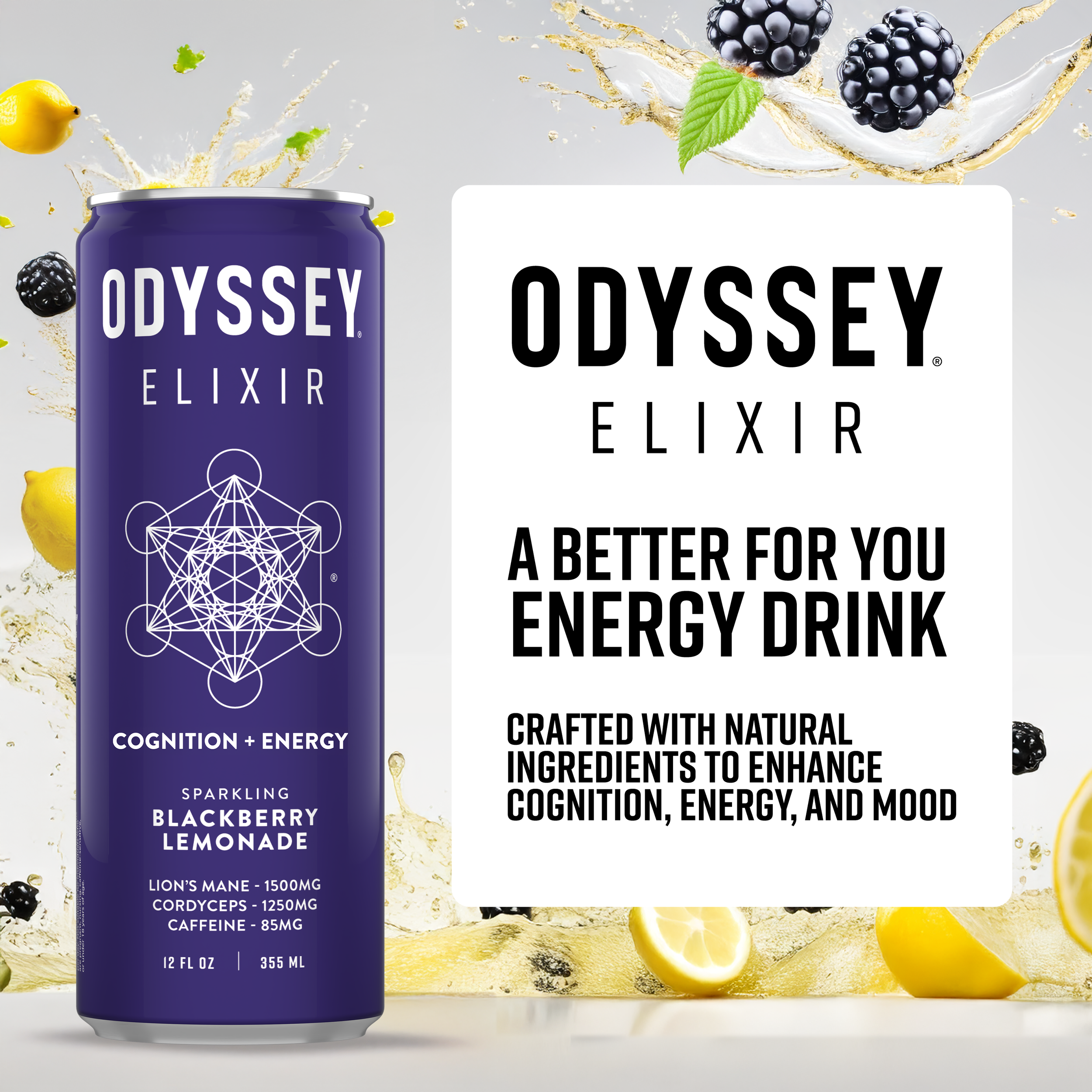
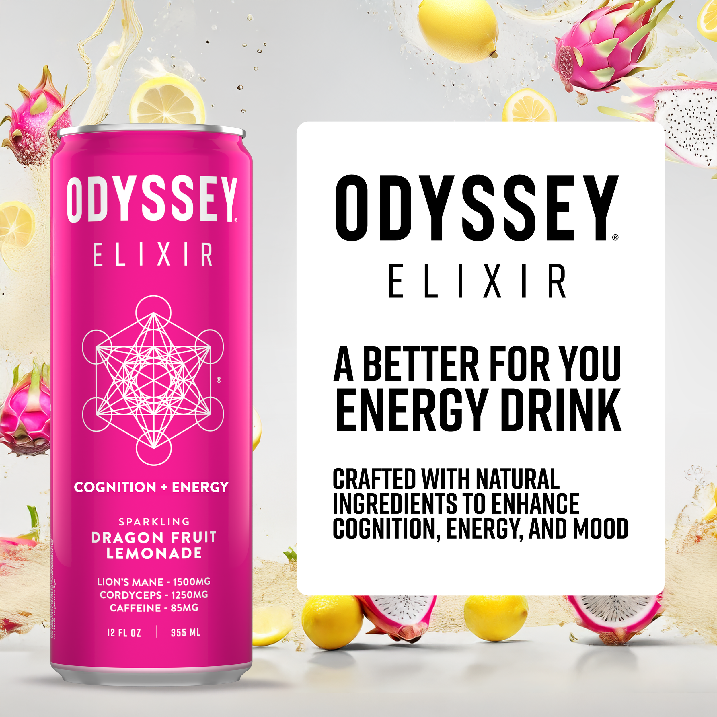
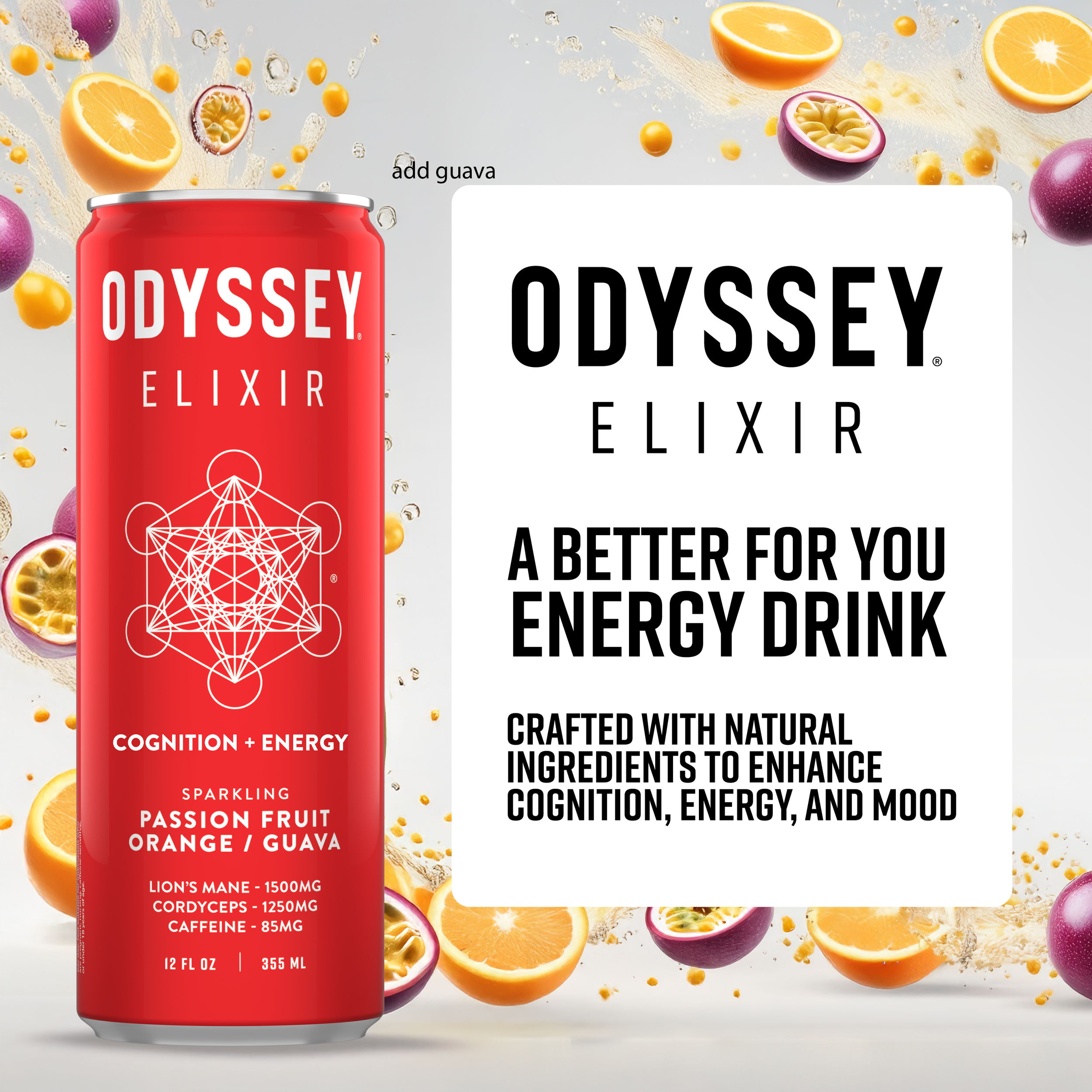
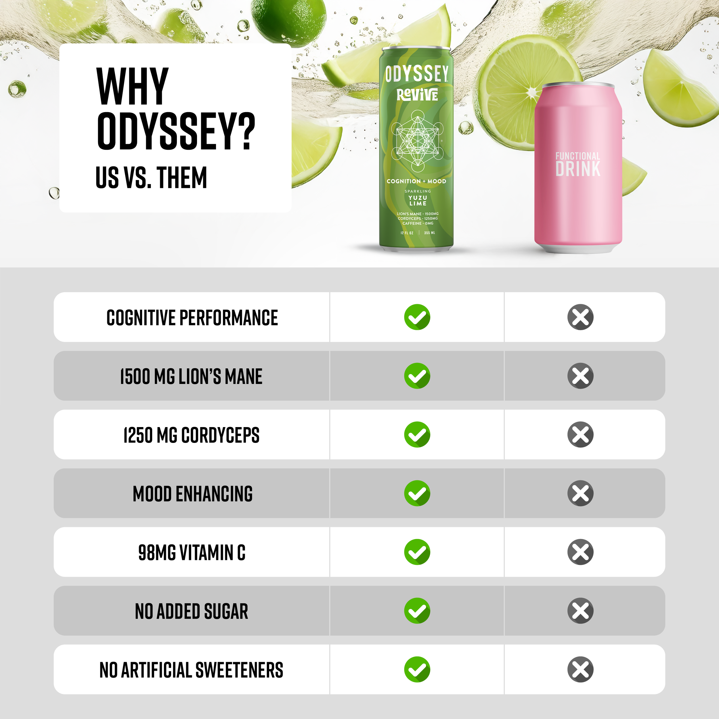
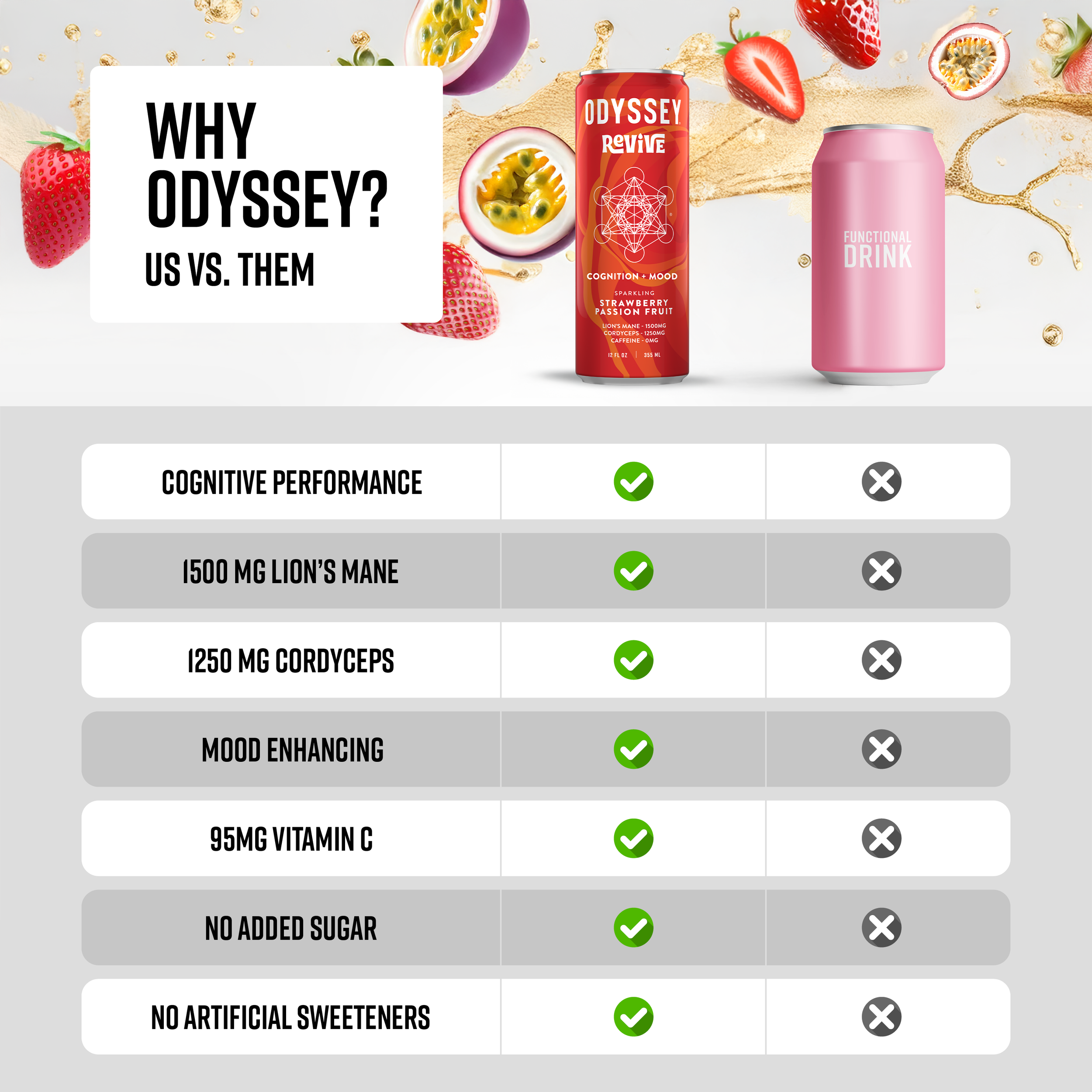
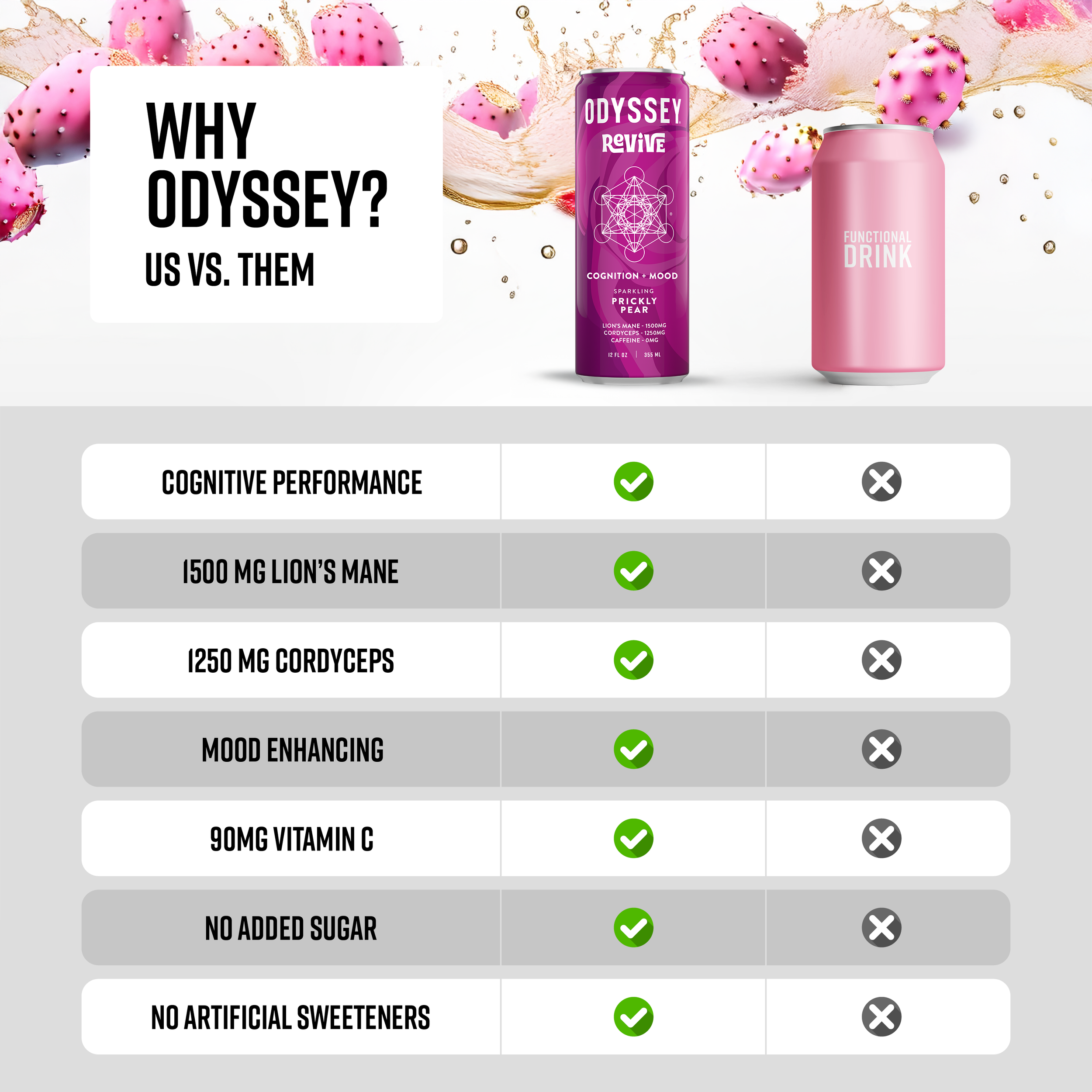
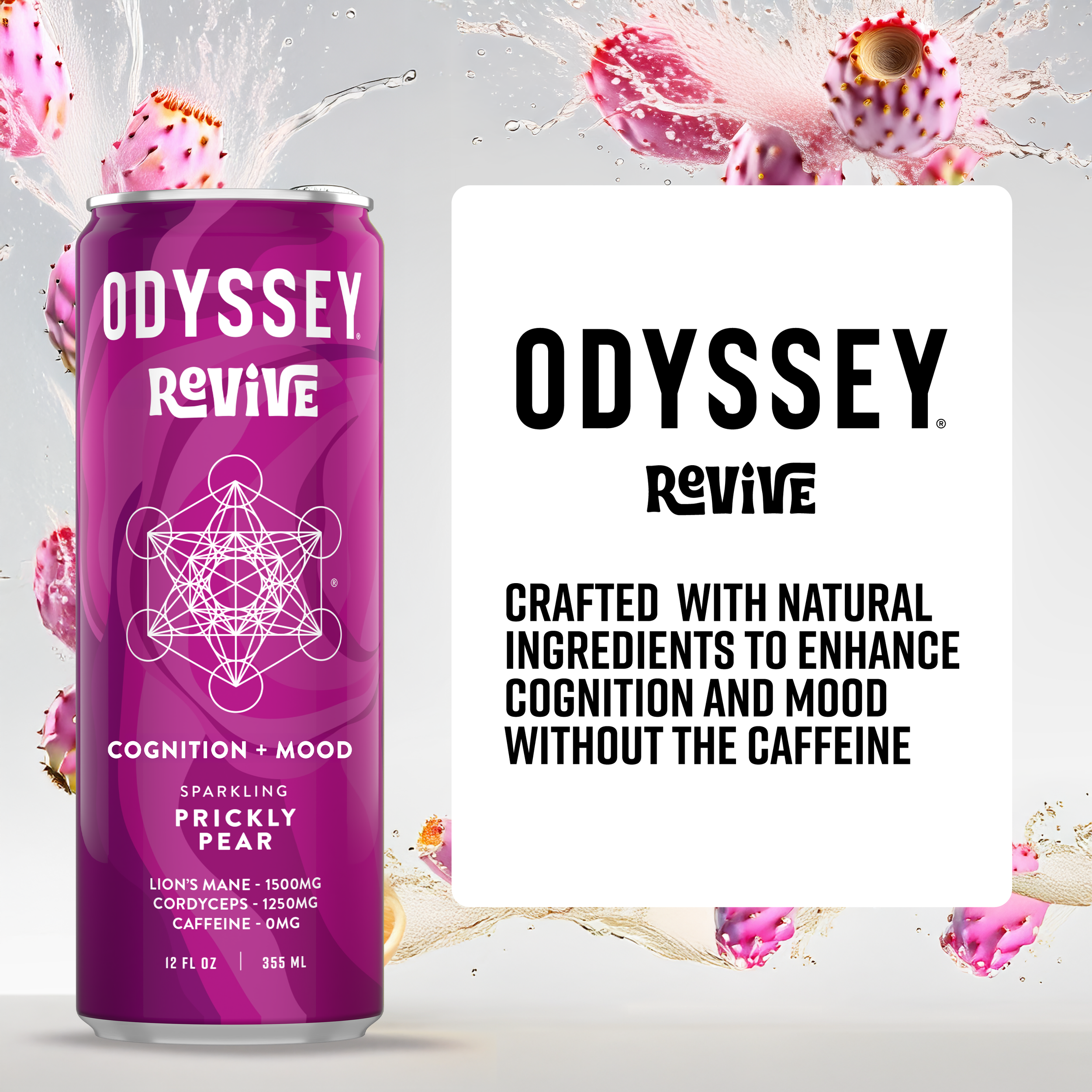
Odyssey recently unveiled a refreshed packaging design, embracing a sleek, minimalist aesthetic to enhance brand recognition and shelf appeal. The new black-and-white color scheme provides a clean, modern look that allows the products to stand out more effectively in a crowded market. To align with this refreshed branding, the entire Amazon ecosystem—including the storefront, listing graphics, and A+ content—was redesigned to create a cohesive and visually striking shopping experience.

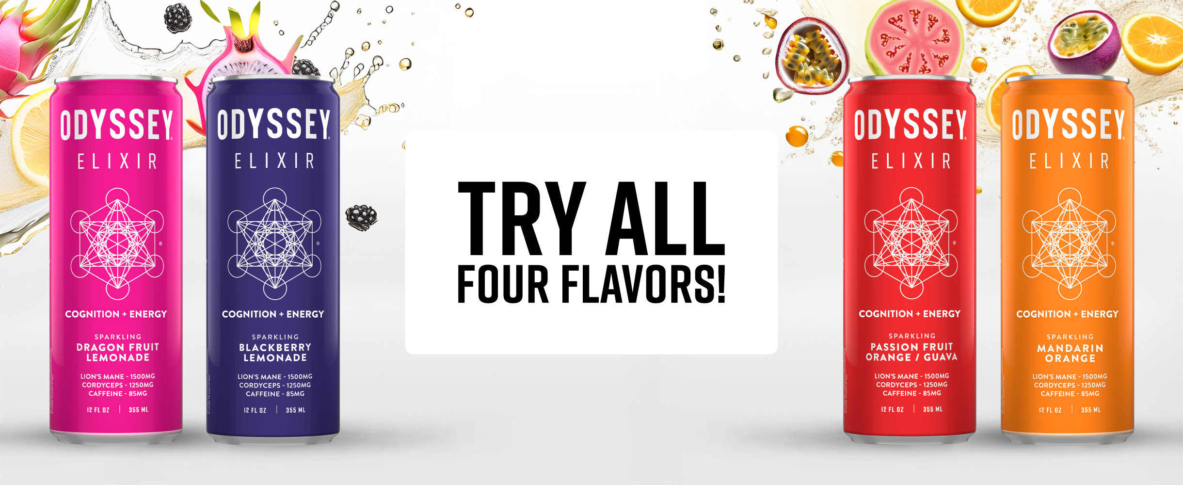


The decision to adopt a minimalist design stemmed from the need to improve product visibility and brand consistency across all digital touchpoints. By utilizing a high-contrast black-and-white palette, the brand reinforces a premium and sophisticated look while maintaining a clean, easy-to-navigate interface. Collaborating closely with the marketing and creative director, we ensured that the Amazon storefront and supporting content not only reflected the new aesthetic but also optimized conversions by focusing on clarity, strong messaging, and an intuitive user experience. This strategic refresh enhances brand perception and strengthens Odyssey’s presence in the competitive e-commerce space.
